By Guest Blogger Mary Doig
She had designed a lovely paisley rug, and was looking for some input on colour.
Charlene had some initial ideas for a colour plan – she wanted to try something different from the usual clear, bright colours that she works in, and use more muted yellows and orange/reds and green. She also wanted a bit of “poison”, as had been discussed in her rug school class on
paisleys. As part of her rug class experience in paisley design, she had coloured in a copy of her original pattern sketch.
Here’s what we did:
We met the night before our dye session to make the action plan. I brought swatches; since I started dyeing years ago, I have been saving approx 2”x 5” samples of every dye formula. The name and formula is attached to each swatch with a safety pin, so it’s quick and easy to refer to
when dyeing.
We put all the swatches out on the table, and Charlene picked the colours she had thought about for the rug. We stowed away the rest so we wouldn’t get confused. Of the colours on the table, she then discarded the colours that weren’t pleasing to her eye. What she was left with was colours that she liked, and interestingly, they all coordinated well. Then we determined the values she wanted of each colour – light, medium or dark.
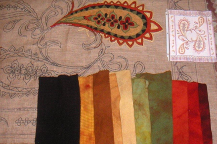
Charlene intended to use primarily recycled wool, so from her stash, we picked what would be best to overdye for each colour. We used recycled white for the lightest value, which was to be a soft mottled gold for background. Because she wanted darker versions of the gold for borders and outlines, we chose a soft yellow to overdye for medium gold and a darker tan for the darkest gold, which would be the outline value. Recycled light orange was chosen for an orange abrash, and recycled lime green for a mossy green abrash, spotted with hints of rust. We used the same recycled orange to overdye two values of red abrash. Some new cream and white textures were used for a sunny yellow and for a rich eggplant. The eggplant was to be the poison. At the same time we were choosing the wools to overdye, we were also measuring (by covering the hooking area four times over with wool, because she hooks her loops quite low) to ensure she won’t run out. After that, along with two glasses of a delightful Pinot Grigio, we were
done for the night.
Charlene was super organized – she soaked her wools overnight in water and dish soap, in separate bowls, and beside each she laid the swatch for the colour that the wool was to be dyed. The next morning we used the open pan method to dye each one in sequence. We kept notes, because occasionally we had to amend a formula slightly, to account for the colour we were
overdyeing. Overall, it went like clockwork – as one dye lot was setting, we were preparing the next one. Charlene has served in the military, and the phrase for that type of action is “working concurrently.” We were lean, mean, dyeing machines (well, Charlene is lean, me not so much, but I make up for it in mean). It was a beautiful fall day here in Nova Scotia, perfect for outdoor drying, so Charlene was hanging our handiwork up on the clothesline as I worked concurrently in the dyepot.
We needed two further dyeing sessions after the initial one….the lightest gold value, to be used for the background, turned out to be too bright. As the late Dorothy Haight, oriental rug hooking guru, would say – it “jumped,” meaning that it didn’t blend well with the other colours. So we took it back to the dyepot and overdyed it with a dilute brown/black combo – what I call my “toning down wash.” I always have a jar on hand, for just this kind of occasion.
And then Charlene decided since she liked the eggplant so much, she wanted to use more. She had a couple of different recycled purples (one was more blue than the other) that she wanted to overdye. Since the colour we were trying to match was already very dark, we knew there was room to darken the recycled purple more while we tried to get it to the right eggplant colour. We threw the recycled purple wool into the dye pot, and by eye, added red brown. It was still too purple-y, so we had a look at the colour wheel, and decided to add yellow as the complement to “brown it down” and that worked well. When all her eggplant is line-dried, she’ll mix it together and it will be spectacular!
Here’s a picture of Charlene’s colours, her pattern with a bit of the hooking done, as well as her initial sketch and colour plan of her pattern. The eggplant looks black in the picture, but it is really a delicious dark red/brown/purple shade.
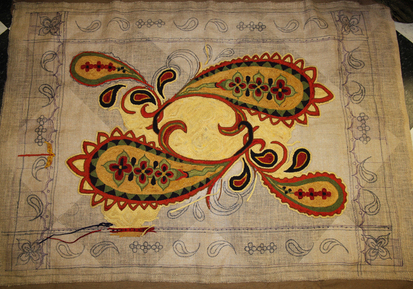
A Passion For Paisley - Designed and hooking by Charlene Scott
Pattern is available



 RSS Feed
