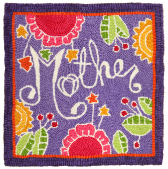
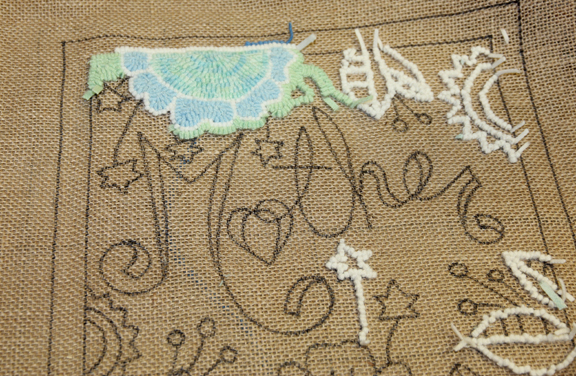
For my Mother’s Day, month of May commemorative rug, I visualized a beach glass soft palette for a shabby chic vibe. I wanted to experiment with a white outline, go the polar opposite to what I generally choose. Every rug I hook I take it in the opposite colour direction of the one before. I like to mix it up and expand my colour planning skill. If hooking for my house I’d be pressed into the primary colours as I would need to match and coordinate appropriately, but for the shop, I’m free to play with ideas that are outside the box of my primary constraints.
At the hook-in before last, I pulled my first loops beginning with the soft Beach Glass tones from the bundles Shane dyes and it didn’t take long to realize the goal I was hoping for wouldn’t suit. I want this line of monthly patterns to blend and stand out boldly and this one would have faded into oblivion. So I switched gears and started from scratch.
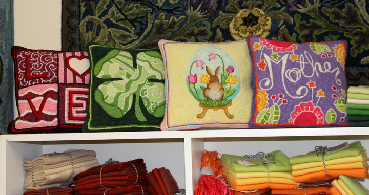
After the hook-in I had wool at home for one of the Alphabet rugs so I pouched it, pulled out all the work except for the white outline and started hooking it again. With the introduction of medium tones of orange, green, fuchsia, golds and a delicious lavender background, it started to pop like fireworks.
Now the pillow sits proudly next to Easter’s soft pastel tones and fits in as if it belongs. A row of pillows of the month with their varying palettes will really dress up the shop with new eye candy.
Now on to Father’s Day. I’ve been distracted by eye problems and boat pressures but I’ll get caught up soon.



 RSS Feed
