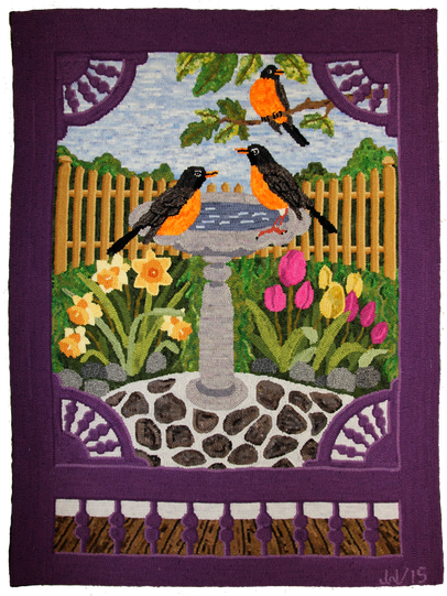
Jean Wentzell is always a welcome sight at Encompassing Designs. Seeing her means she’s in for show and tell and she always puts on a fabulous cabaret of colour and talent! Jean has hooked a lot of my patterns over the years, usually ones that I’ve custom designed for her and she always does them justice.
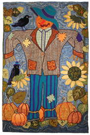
Recently we’ve been working on seasonal pieces of a specific size for her to hang in a special spot in her home. She likes to change the scene to match the season and always has a rug hanging to admire. So far she’s done Patches for the autumn, a medley of fall colours, with pumpkins and a delightful scarecrow.
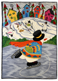
Winter Games came next for winter and I can’t say enough about this standing ovation. Bravo! This beautiful creation just might be my favourite rug for the entire 2015, both for the whimsical composition, (I’m slapping myself on the back for this one), and of course Jean’s hooking!
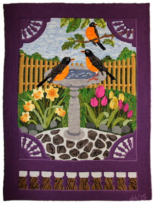
Now Jean has completed her spring and I couldn’t be more pleased with the finished product. Looking through the screen door to the garden beyond, Spring Has Sprung, tells a true tale of the season. The majestic robin is always the first sign of this new season and the grass sheds its dull winter coat to don a rich mossy green. The buds on the bushes and trees blossom into canopies of green, each one unfolding in slow motion wonder. How wonderful to hook a rug depicting the season of new life and rebirth and bring a bit of that magic inside. We change our clothing for the period, some even switch up bedspreads and throws and pillows in the living room so why not coordinate rugs for the four seasons of this magnificent planet?
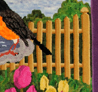
Not only is this piece lovely, there are teaching tools to be shared. I love making things look three dimensional and passed on these simple tips to create a big look in the fence and screen door. My Moonstruck Wanda rug was the first time I shaded a fence and it brought added dimension to a very low contrasting scene. The fence pops when viewed from a distance. The area was dark to work in but with the proper execution of shading to show a light source, you can really make a motif pop with proper manipulation of colour.
It’s really all about the light source. Pick where you want your imagined sun to be, or if doing something inside where is the lighting? Once that is established the shadows are easy. If the sun is on the top left, all of the darker shadows will go to the right of the object, and the lightest will go to the left as if the sun is shining directly on the surface. The middle will be just that, a middle value. Yes, it is as simple as that! Stay true to the plan, as not to confuse the eye and in the end you will have a rug that really pops to tease the viewer into thinking its lifting off the page. The horizontal braces that show between the fence boards would be treated in the same fashion. The top part is where the sun would hit so they are done with the lightest value, the middle value for the center and the darkest value on the bottom where the sun wouldn’t reach and the shadow would be.
Jean told me she wanted a yellow fence and together we zeroed in on our formula for Goldenrod, one of our Majic Carpet formulas from the book, Antique Colours & Spots, Shane dyed the three values over natural needed for the shading to give the fence prominence. We decided the light source would be coming from the top, right hand and after that it was a repeated hooked plan of the darkest value on the left, followed by the middle value for the center of the fence posts and then followed up by the lightest value for the right side. It turned out beautifully and the goldenrod was the perfect colour way for the rest of the rug. It picked up the tones from the flowers and the golden bits in the leaves in the hanging branches overhead, creating that needed triangle for balance.
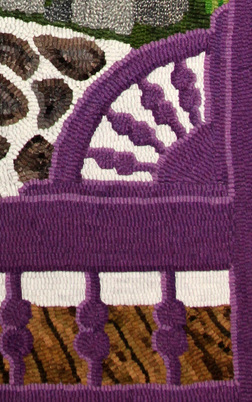
The screen door was executed in the same manner. Jean had her mind on purple and purple it is. The left side of the spools and framing were done in the darker purple, a Jacquard formula that Shane cooked up in the pot. The majority surface of the wood is the middle value and the lighter gave it all a highlight on the right. It is more subtle in the darker woodwork but the eye detects a separation giving it depth and interest. Hooking it entirely in the one shade of purple would have made it appear flat, with zero interest or character. This way the eye is guided into the center of the design where the focal lies, not distracted by a wall of flat purple.
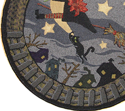
| The moon is on the left so the fence is shaded with the lightest value on the left as if the light source is illuminating the top and side of the fence post. The middle is the bulk of the fence post and was done in a medium heather grey and the right top and edge is in a charcoal as that is shaded from the light source. The horizontal bracing was done in the same pattern, lightest on top to reflect the light source and the darkest on the bottom to show shadow. The fence pops off the page! | 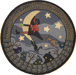 Moonstruck Wanda 28" Dia. Hooked as an exercise in low contrasting colours. The actual rug is much darker than the photograph. Pattern can be viewed on my Seasonal Designs Page by clicking the link: http://www.encompassingdesigns.com/seasonal-designs.html |



 RSS Feed
