| Hit & Miss Whale 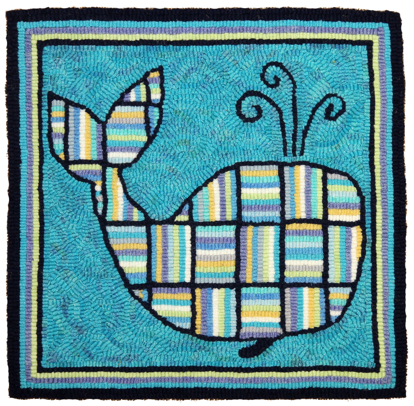 | Hit & Miss Butterfly  |
y back is back, so too am I. Funny how certain postures and positions can do you in. Remarkably I was able to sit and hook, with support pillows jammed into the curve of my back to keep it rigid and straight and at the proper angle, but getting in and out of the chair was a bit of a challenge. Nothing makes a person feel older than not being able to eject yourself from a chair with a smooth and fluid motion. Getting out was painful, bent and clutching the chair arms, moving at a snail’s pace as not to jar the tender nerve waiting to dance upon the bone and send me into a spasm. I looked and felt twenty years my senior. Of course there are sighs and noises that escaped my lips, dins I’ve only heard when working in a nursing home, or when our friend Peter comes over for dinner. Poor guy, I think a couple of knee replacements are in his future. Oh, the sights and sounds of the less nimble, clackity clack of bone on bone, the song of our future.
But I must look on the bright side on this post icey, storm day of yesterday. All is calm and the sky is as clear as was my prepubescent face, the wind has died, no longer stripping shingles from my roof to scatter about the yard. Today, my cup is half full. Although at times my back still creaks in protest, I’m on the green side of the grass, the roof hasn't leaked despite numerous attempts by mother nature's fury, and I have two more hooked pieces to feel proud about. (We have a roofer coming first thing in the Spring....hopefully it can hold on, to its shingles that is...)
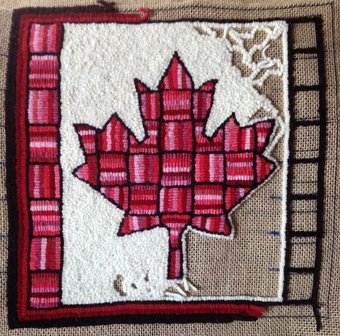
I started a series called Hit & Miss Minis of 12" x 12" rugs. The first was the whale done in blues and turquoises, then the Butterfly in golden oranges and now I’m working on the Canadian flag, well in time for this year’s 150 birthday celebration. If interested, the patterns are for sale. We have them in 12' x 12" but if anyone is interested in a 16" x 16" size let us know. The actual pattern for the whale has an eye to be hooked but I thought I would look for an oval button to sew on.
I’m making these rugs into pillows for a display in the shop. I have to admit that hit and miss is striking, it catches the eye immediately when walking through the door and I do love to have more eye candy for the studio. I'm sure these will be popular kits, beginners love to start with hit and miss projects, practicing those straight lines to perfect the technique before moving on to wavy lines and circles.
The lineal structure of vertical and horizontal lines is very pleasing to view but I have to admit, there’s not much hit and miss to hit and miss anymore. Before it was whatever was on hand, using up cut strips, worms leftover from previous projects, but now with unlimited dyed wool to choose from, it is colour planned and calculated. I choose to do mine with a monochromatic feel, all colours blending, but perhaps I’ll mix it up on the next one.
Below is the work in progress for the Hit & Miss Canadian Flag I will finish tonight. I stayed with the reds and white to represent our actual flag colours. I hooked the background in a #3 cut and pixelated the loops instead of following the holes in regular hooking. I find white doesn't fill in as well and I didn't want to see where the tails started and ended nor did I want to pack it tightly to keep the shadows of the loops from showing. I might not have used white if I'd thought it through. Perhaps a slightly off white, with a wash of the lightest colour would have been less stark against the deep reds, I even toy with changing it but then think....who am I to change the actual colours of our flag. For monitors that make this look more pink, I assure you it is tones of red, some are even brownish with an orange undertone. Come by the shop to see!
But I must look on the bright side on this post icey, storm day of yesterday. All is calm and the sky is as clear as was my prepubescent face, the wind has died, no longer stripping shingles from my roof to scatter about the yard. Today, my cup is half full. Although at times my back still creaks in protest, I’m on the green side of the grass, the roof hasn't leaked despite numerous attempts by mother nature's fury, and I have two more hooked pieces to feel proud about. (We have a roofer coming first thing in the Spring....hopefully it can hold on, to its shingles that is...)
I started a series called Hit & Miss Minis of 12" x 12" rugs. The first was the whale done in blues and turquoises, then the Butterfly in golden oranges and now I’m working on the Canadian flag, well in time for this year’s 150 birthday celebration. If interested, the patterns are for sale. We have them in 12' x 12" but if anyone is interested in a 16" x 16" size let us know. The actual pattern for the whale has an eye to be hooked but I thought I would look for an oval button to sew on.
I’m making these rugs into pillows for a display in the shop. I have to admit that hit and miss is striking, it catches the eye immediately when walking through the door and I do love to have more eye candy for the studio. I'm sure these will be popular kits, beginners love to start with hit and miss projects, practicing those straight lines to perfect the technique before moving on to wavy lines and circles.
The lineal structure of vertical and horizontal lines is very pleasing to view but I have to admit, there’s not much hit and miss to hit and miss anymore. Before it was whatever was on hand, using up cut strips, worms leftover from previous projects, but now with unlimited dyed wool to choose from, it is colour planned and calculated. I choose to do mine with a monochromatic feel, all colours blending, but perhaps I’ll mix it up on the next one.
Below is the work in progress for the Hit & Miss Canadian Flag I will finish tonight. I stayed with the reds and white to represent our actual flag colours. I hooked the background in a #3 cut and pixelated the loops instead of following the holes in regular hooking. I find white doesn't fill in as well and I didn't want to see where the tails started and ended nor did I want to pack it tightly to keep the shadows of the loops from showing. I might not have used white if I'd thought it through. Perhaps a slightly off white, with a wash of the lightest colour would have been less stark against the deep reds, I even toy with changing it but then think....who am I to change the actual colours of our flag. For monitors that make this look more pink, I assure you it is tones of red, some are even brownish with an orange undertone. Come by the shop to see!
Hit & Miss Canadian Flag


 RSS Feed