The Story of a Jacobean Crewel Mat by Heather Gordon
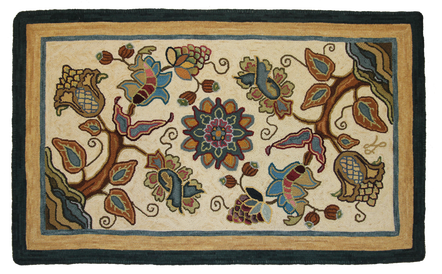
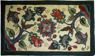
I had completed two previous Crewel projects – a bell pull and a lovely mat that Christine designed for me and named “Heather”. The mat is quite striking with beautiful floral colours on a black background. This time, my friend, Lesley Marshall, encouraged me to join her at another course and asked Christine to design a mat for her which was named “Lesley”. Lesley finished hers right away, and you can see a photo on the Encompassing Designs web site and attached to the pattern. Mine sat in a box.
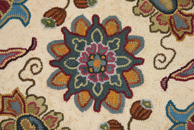
Why did I abandon this lovely design? Well, it had nothing to do with the design, which I loved – especially the centre medallion. I think we have all had the experience of a project that just doesn’t come together. I started with a vision. This was going to be a traditional Crewel. I could see it in my mind with the colours of those gorgeous embroidered panels in the Victoria and Albert Museum. It would have an off-white or parchment background with gold, rust, olive, bronze, brown and teal motifs. Instead of red, I would use variations of dusty rose or raspberry shades since strong reds don’t work in my house. It just did not turn out that way.
My second attempt was a slight improvement on the areas that I had hooked. I changed the colours in the central medallion and adjusted one of the floral motifs. So much for that. Back it went into the box.
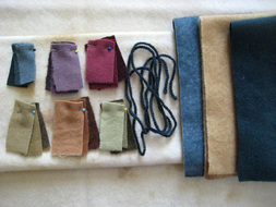
I knew that I had some of the colours right. Along the line, I had picked up some of Christine’s 3-value swatches. Anjou Pear, Cranberry and Ganache worked well together but I still did not have the right teal and my rusts and browns were too strong. I started to think about some of the colours that I had seen in the shop and for my gift to myself at Christmas 2011, I bought more 3-value swatches, adding Teal, Coppertone and the new Magic Mix that Shane had just invented. Then I got out a variety of swatch remnants (some Jacobean blues, dusty rose, golds, plum colours and more greens) and got inspired.
Each year, I go on a 4 day retreat to White Point, a traditional lodge/resort on the South Shore of Nova Scotia. There are 12-15 of us and we tend to either take a special new project or a project that challenges us. I spent most of the time (aside from the eating and drinking part) colour planning and experimenting with crewel colour combinations. It was great. Colour planning is my favourite part. By the time I left, the project was well on its way.
This was my main project last spring. It was set aside in June so that I could design and hook 3 pieces for summer shows. I did some hooking on it in the fall, alternating with more interesting pieces because by then, I was just working on background and borders. Then, in January, I felt the need to finish it and here it is.
Main Swatches: Anjou Pear, Cranberry, Teal, Coppertone and Max Brown
Additional Colours: Leftovers from previous projects including bronze, Jacobean dusty rose, some bluish teals, transitional gold/tans and a variety of greens and purples for the grapes.
Background: The first off-white I tried was too bright. The second was too yellow. The third was too drab and the fourth was JUST RIGHT. It is a light solution of Max Brown, abrashed with a slightly stronger solution of the same colour.
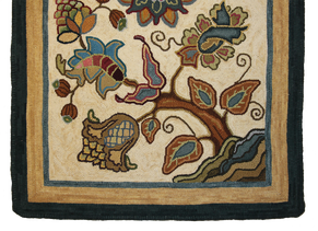
Outer Border: I used the same mid-value teal formula from Christine’s Sky Blue Pink dye book that I also used in the main field. The next gold band is a mid-value of Max Brown, from the same book and this was also used in some of the motifs. The outer band is a stronger value of the Teal.
Finishing: Whipped with cording and natural Briggs & Little yarn dyed in the same dye bath as the outer border Teal.
Cuts: Design motifs were hooked in #4 cut with #3 for the finer details. Most of the leftover swatches that I used are #3 because they came from my early hooking days when that was the standard for shaded pieces. The background is hooked in #4. I tried #5, but it looked too heavy for the design. I did go to #5 for the first two sections of the outer border and I used #6 for the darker outer teal because it grounded the mat well.




 RSS Feed


