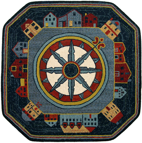
I used 5 cut for the compass point outlines, 7 cut for the dark teal segments surrounding the buildings & a 6 cut for everything else. All the wool I used was new off-the-bolt.
Excluding the cream center, I limited my wool choices to 5 colours. I didn't want the buildings to compete with the compass. And I was concerned that if I didn't limit the number of colours, it would become too 'busy'. As a general rule I try to limit my rug colour schemes to no more than 6 choices because I find simple is better in most cases. If too many are used sometimes it's hard to appreciate the design. I call this 'too much noise'.
And to tie it all together, as with most of my rugs, I used most of the colours in the border. This way, everything is nicely tied together
Sue
**************************************************************************************************************************
The great appeal of this rug is that it's filled with texture. Plaids are key to breathing life into a piece and manipulating them with both horizontal and vertical lines, added even more interest to the overall design. Sue's balanced colour plan ensures that no particular item steals the show.
Starting with the center compass lightness and gradually darkening to the outer background certainly pleases the eye and the one row of each colour in the outer border, wraps the design with the ultimate frame.
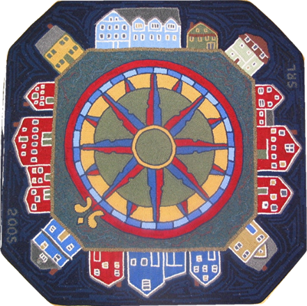
The darker plaid used for the building background and center of the compass feels like dark water or a night sky, pushing the colours out so the rug pops even though the tones are more subdued than vibrant. Susan Leslie designed and hooked the original version and generally I like the artist's vision, but for this piece, I have to say that Sue has created maximum personality with her colour selections and positioning, and I predict that it will rejuvenate interest in the pattern. A great job!!!
Pattern can be viewed by clicking the link and scrolling down: http://www.encompassingdesigns.com/susan-leslie.html





 RSS Feed
