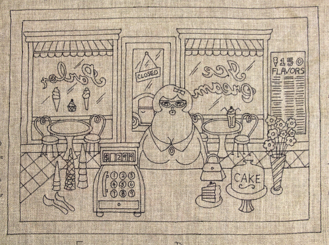
This pattern was a bit of a challenge to design and a witch to draw. All those straight lines of the windows, the door and floor around all of the motif. Straight lines have to be drawn separately and the red dot has to sit on the pattern perfectly straight. Me and my detail. Whoever takes this one on better like working in a bit of #3 cuts. I’d do it in #3 and #5.
Making the scene look like an ice-cream parlor from the inside looking out took a bit of planning. Then I had to figure out how much detail of the outside should show through the windows. There comes a point when too much motif can detract from the focal point of the rug so I allowed a Volkswagen Beetle to be parked outside the door but added nothing to show through the large plate glass windows. There was enough going on with the backwards lettering of ICE CREAM on one window and PARLOR on the other and the back side of the awnings to fill the space.
At one point I had people sitting at the tables, one couple sharing a milkshake, sipping at two straws like love struck teenagers but I erased them, left the milkshake, perhaps they both snuck off for a little hanky-panky in the bathroom. Once again keeping it simpler to focus on the main point which is; a customer looking up at the implied billboard with a 150 flavours of ice-cream, cakes, cupcakes and milkshakes and trying to pare it down to one choice, one flavour; hence “Sweet Indecisions”.
Like I usually do, as a design is evolving, I think about colours and for this one all I could see was pink, like a big puff of cotton candy had filled my brain. Pink is happy and feminine, girly all the way and I associated it with candy as well. Perhaps bubble gum is the influence, or wintergreen mints, suckers, Popsicles, sweet hearts, chicken bones, Dum Dums, gumballs, strawberry ice-cream, milkshakes and remember pink popcorn? I can almost smell the sugar and feel a cavity in my back molar.
I envisioned the awnings to be pink and black. The tiles on the floor could be pink and black, pink walls with white woodwork. I feel this piece should emanate a pink aura with accents of all the lovely colours that compliment it, like soft greens and yellows, oh yes, I can see it now. If I get time I’d like to colour this one in using Photoshop, if only I could stretch the day like a rubber band.
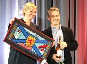
I would really like to hook this one for the fun of it and hang it in the shop as a light and airy summer piece, but alas, I know I won’t. I have so many items I need to hook on my list; seven remaining risers, and another rug for our boat for the North American Nonsuch Rendezvous being held in Halifax in August this year. It’s an exciting event with our Nonsuch boats on display, showing and sharing how we appoint them, renewing the bright work, polishing the stainless, swabbing and waxing the decks, improvements etc. For me, a colourful, nautically inspired, custom rug will go a long way to pimping our boat in an extra and unique way. I’ve already completed a compass rose rug and now I want a companion piece with the same rich palette for below the companionway stairs. Luscious nautical reds, deep navy blues and glorious golds will adorn her teak and holly floor as two, one-of-a-kind hooked rugs providing beauty and non-slip walking though the cabin. Yup, I plan to mix my passions, marry sailing and my beloved craft as much as time allows! I have also designed what I am calling, Encompassing Designs Tartan, which will be the center of this new pattern. Stay tuned.

 RSS Feed
