I opened the shop on Saturday despite the wind and a few people wandered in while Charlene, Patsy and I hooked. I started and finished the A and then began the O Sunday afternoon. I'm pretty jazzed about the greens and purples, they literally glow.
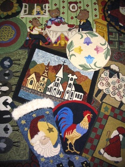
So far, I am still pushing the endorphins as I think about, and colour plan each letter. This O represents the 9th letter with more ahead than behind me, but the creative juices are flowing so I’ll ride the wave as long as I’m having fun. I feel the poster, the end result from all these letters, will be perfect for colour planning so it will be practical as well as pretty. I can see it in my head as clear as day and that's what lights my fire.
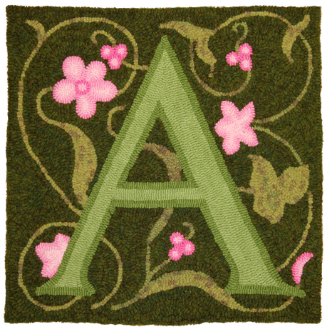
The A was hooked for my Aunt Audrey. I'm still picking through the letters that mean something and then will fill in the ones that don't. I could have said the A was for the storm "Arthur", but who wants to celebrate something that causes destruction. A is also for Ashley, Shane's girlfriend. Pretty with delicate pink flowers and a mossy green letter. I feel the darker green plaid offers a depth to the background as if looking through a dense bit of foliage.
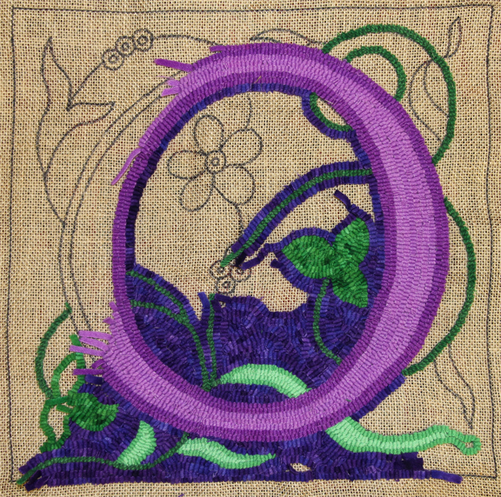
The O is hooked with three value Mint and Blue Violet, Purple Rain spot and Jolly Green Spot. O is for Olsen, my mother's maiden name. It could also stand for "Over" the moon because this is the 9th letter I've worked on! I am in love with the Purple Rain effect! I have enough of the letters hooked now that you can see how colourful the poster will be. If you would like to see how they are shaping up, click this link: http://www.encompassingdesigns.com/new-designs.html

 RSS Feed
